Every Trader Looks at One Thing — The Chart
Before indicators, before patterns, before any strategy — there's the chart. It's the visual representation of every buy and sell decision made by millions of traders worldwide. And how you display that data matters more than you'd think.
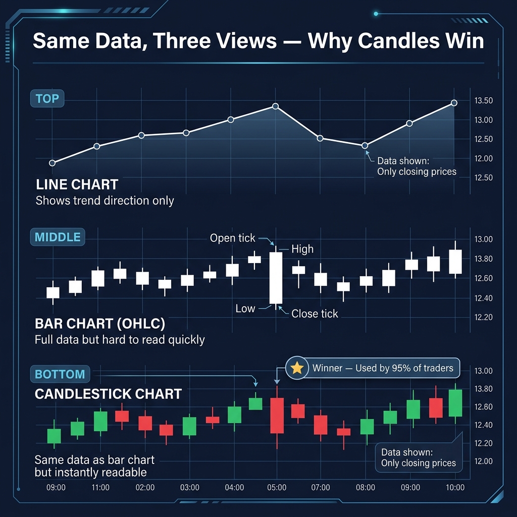
There are three main chart types in forex. Most beginners start with line charts, but there's a reason 95% of professional traders use candlesticks. Let's see why.
The Three Chart Types
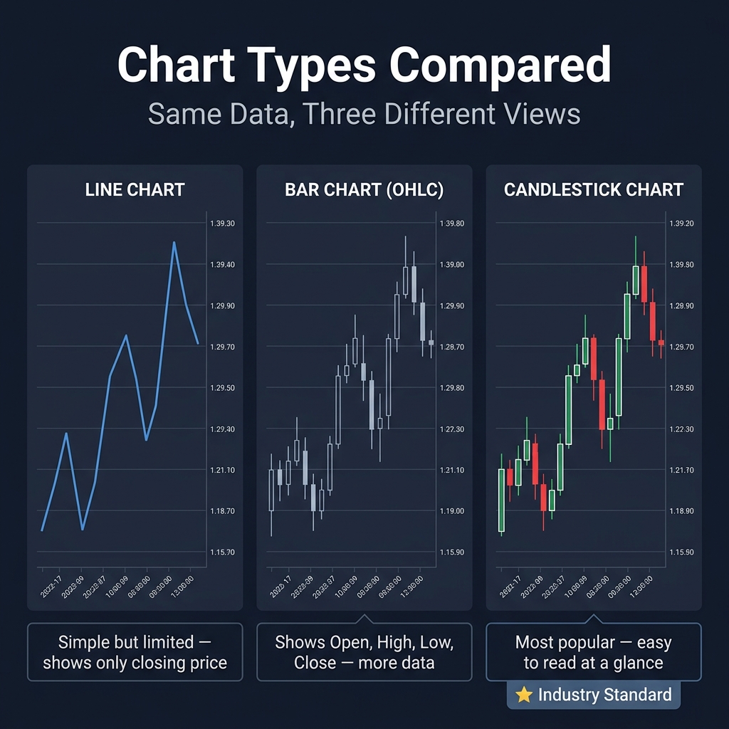
1. Line Chart — The Minimalist
A line chart connects each period's closing price with a single line. It's clean, simple, and easy to read at a glance.
Pros: Clear trend direction, no noise, great for long-term perspective.
Cons: Shows only closing prices — you can't see the open, high, or low. You miss the battle within each period.
Best for: Getting a quick overview of trend direction. Not for making trade decisions.
2. Bar Chart (OHLC)
Each bar shows four data points: Open, High, Low, Close (OHLC). A small horizontal tick on the left = open price. A tick on the right = close price. The top and bottom of the vertical bar = high and low.
Pros: Full price data per period. More information than a line chart.
Cons: Harder to read at a glance — the visual information is dense and takes time to interpret.
Best for: Experienced traders who grew up with this format (mostly older-school traders).
3. Candlestick Chart — The Industry Standard
Candlestick charts show the exact same data as bar charts — but in a format that's instantly readable. The "body" (colored rectangle) shows the range between open and close. The "wicks" (thin lines) show the high and low.
Pros: Easy to read at a glance, patterns are visually obvious, universally used.
Cons: Can be overwhelming with too many candles on screen. Takes some learning to interpret patterns.
Best for: Everyone. Seriously, just use candlesticks.
Why Candles Win
| Feature | Line | Bar | Candlestick |
|---|---|---|---|
| Shows Open | No | Yes | Yes |
| Shows High/Low | No | Yes | Yes |
| Shows Close | Yes | Yes | Yes |
| Easy to read | Very | Moderate | Very |
| Pattern recognition | None | Limited | Excellent |
| Industry standard | No | Declining | Yes |
Candlestick charts give you the most information in the most readable format. Every lesson from here forward will use candlestick charts.
Quick Recap
- ✅ Line charts show closing prices only — good for quick overviews
- ✅ Bar charts (OHLC) show all four price points but are harder to read
- ✅ Candlestick charts show the same data as bars but in a much easier format
- ✅ Use candlesticks — they're the industry standard for a reason